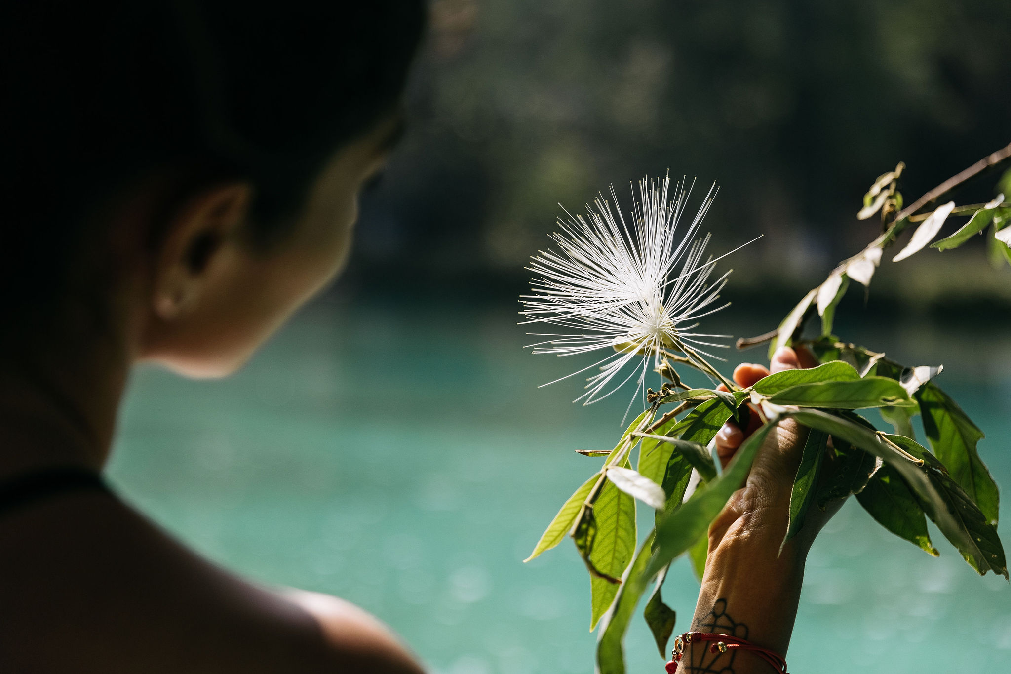
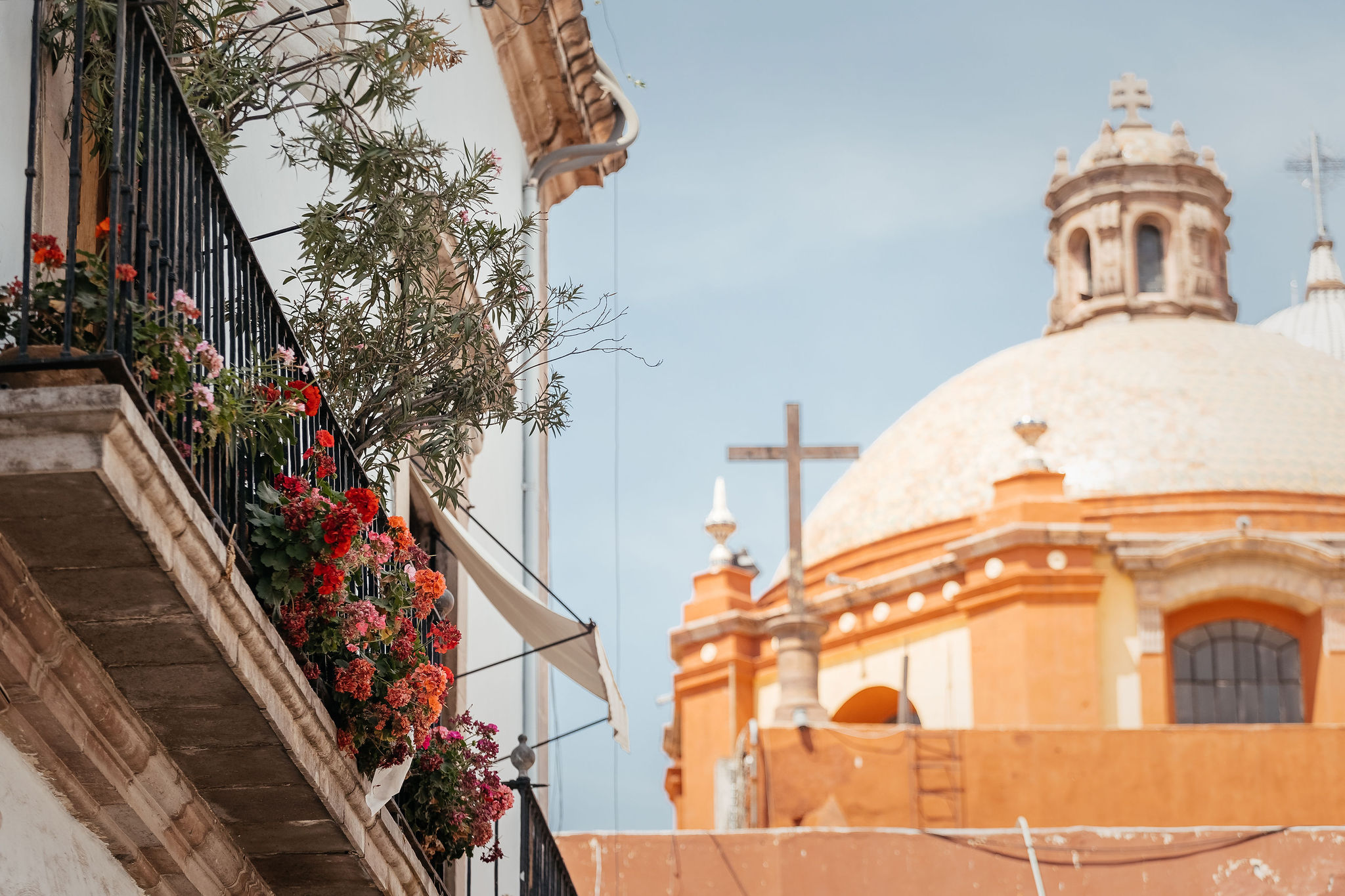
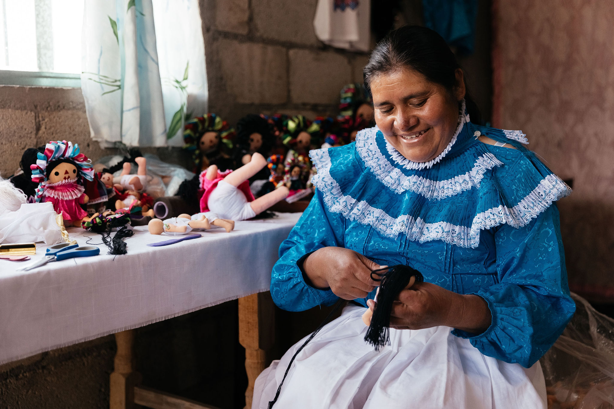
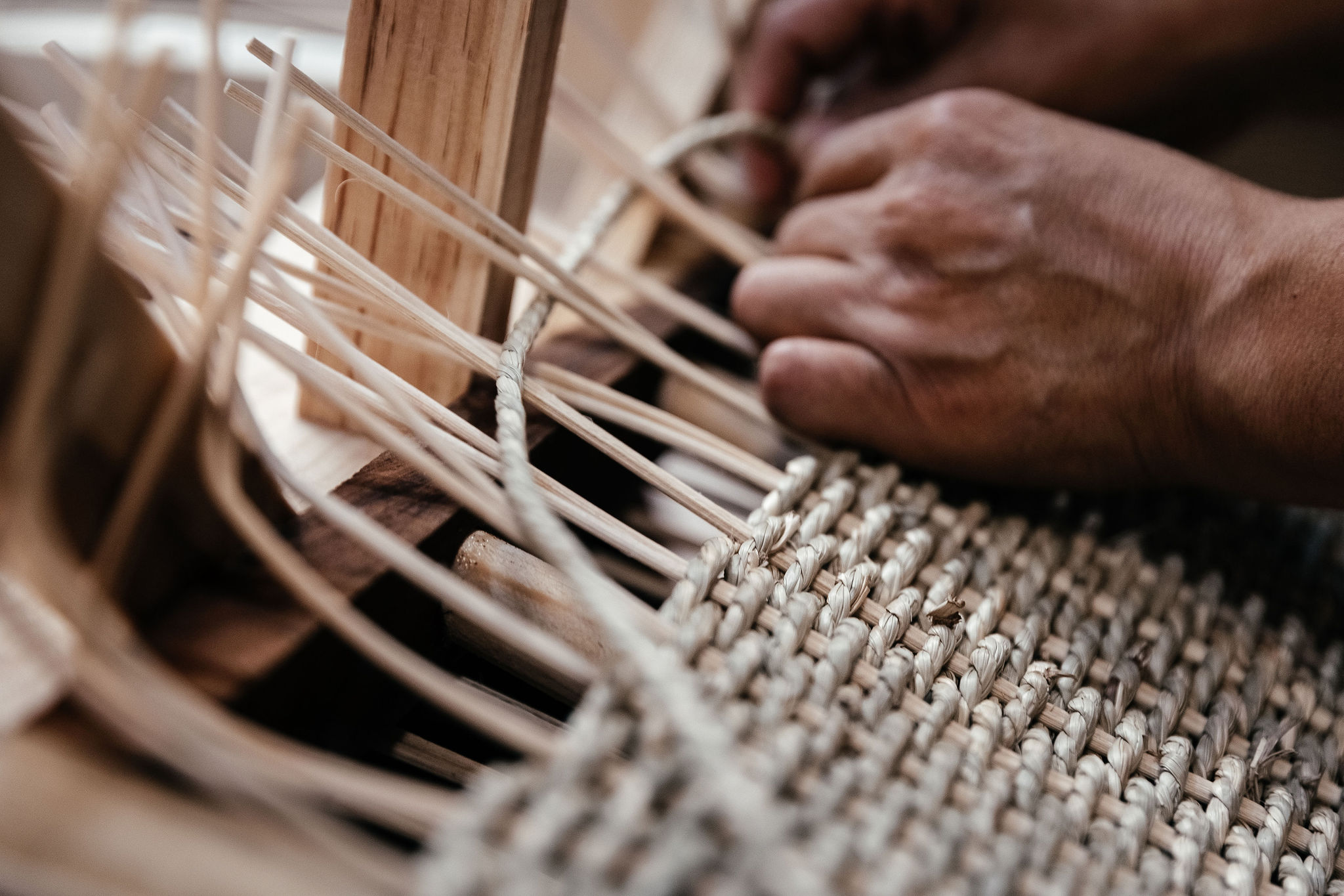
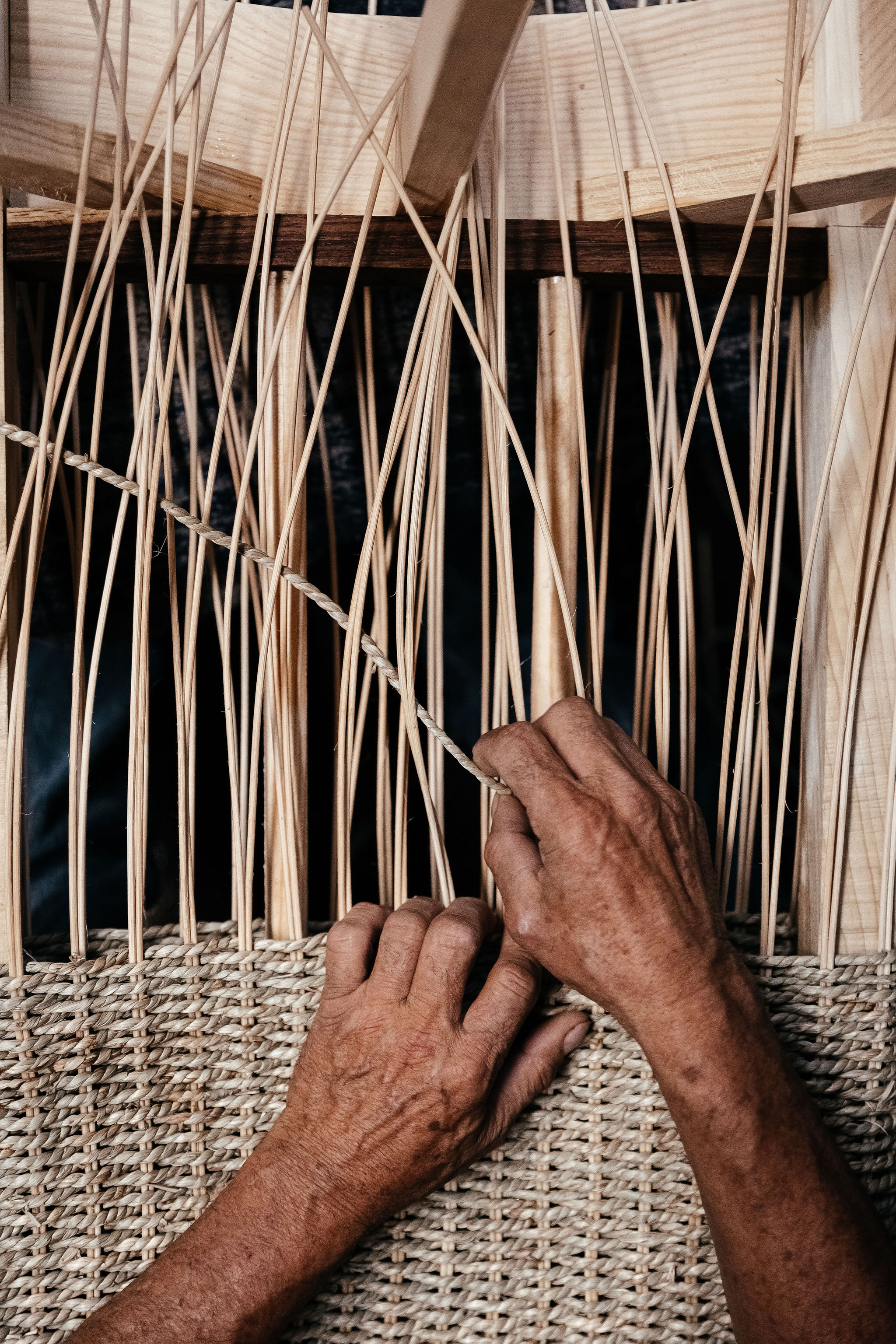
LaTour Crafted is a meticulously curated travel and lifestyle brand that combines powerful local experiences with genuine cultural immersions to rejuvenate travelers from the inside out.
LaTour, meaning "the tower" in French, encompasses the belief that we must create consciously, inclusively, and sustainably to thrive in a future beyond today.
The brand shifted from conventional luxury travel after observing a rise in demand for authentic, transformative experiences. Inspired by the concept of meaningful journeys, the team set out to create efficacious travel experiences that celebrate local cultures without compromising the Earth.
When
November 2021
TEAM
Words & Creative Direction by Gad Nuñez Designed by Pepe Cacho Strategy by Mari Carmen Geiger Photography by Alex Krotkov Client - Noemi Mones
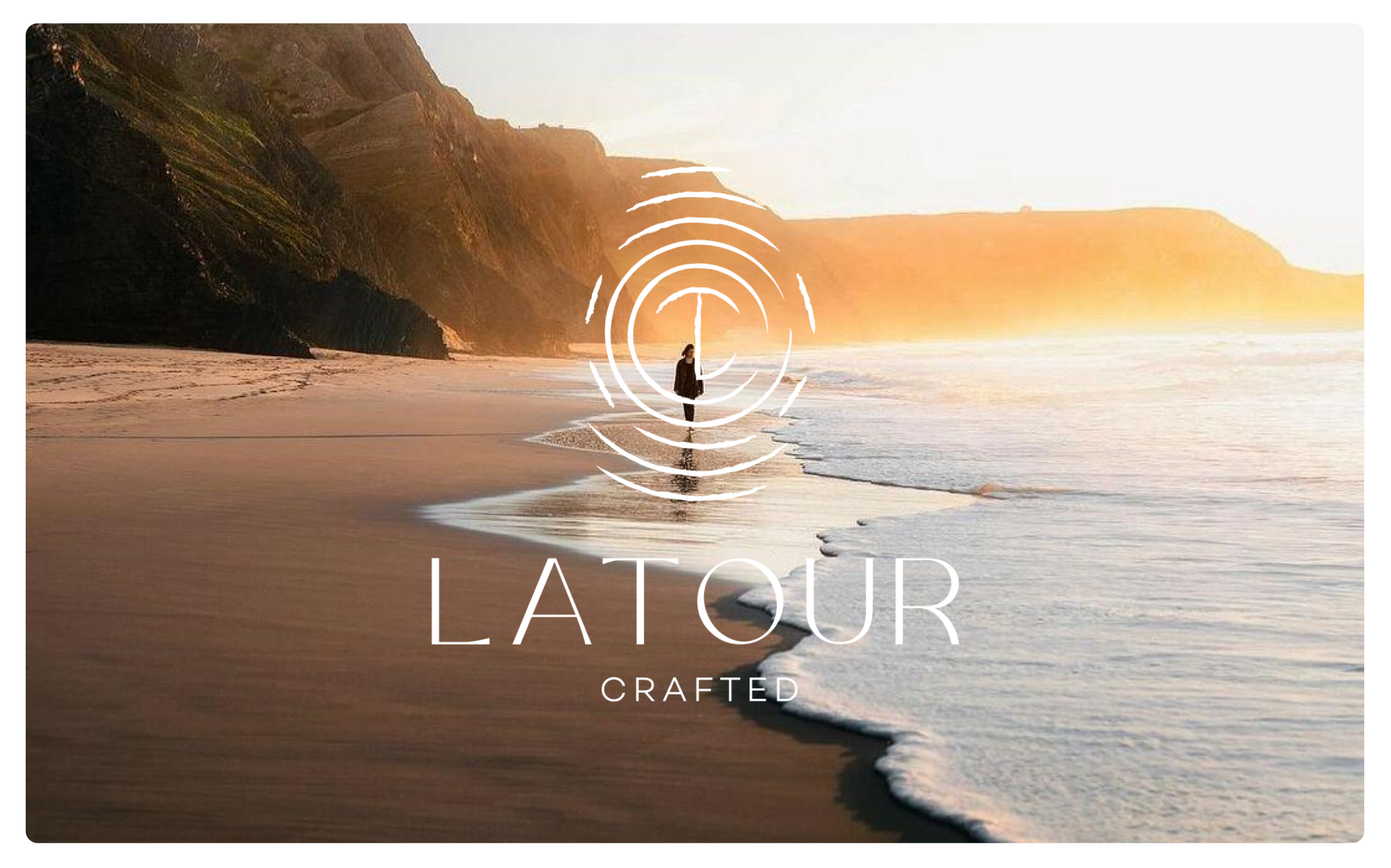
LaTour Crafted is a locally-inspired luxury travel brand—a meticulously curated travel and lifestyle company that combines powerful local experiences with mood-boosting cultural immersions to rejuvenate travelers from the inside out. LaTour, meaning "the tower" in French, encompasses the belief that we must create consciously, inclusively, and sustainably to thrive in a future beyond today. LaTour's visual system is inspired by local authenticity, creating a physical and ethereal space for meaningful travel and self-discovery.
Working very closely with LaTour's visionary team, we crafted a language for brand strategy and visual identity within existing market constraints, while maintaining one of the most valuable pillars of the brand: conscious travel. The local community wastes nothing, and neither do we.
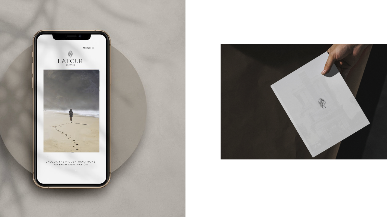
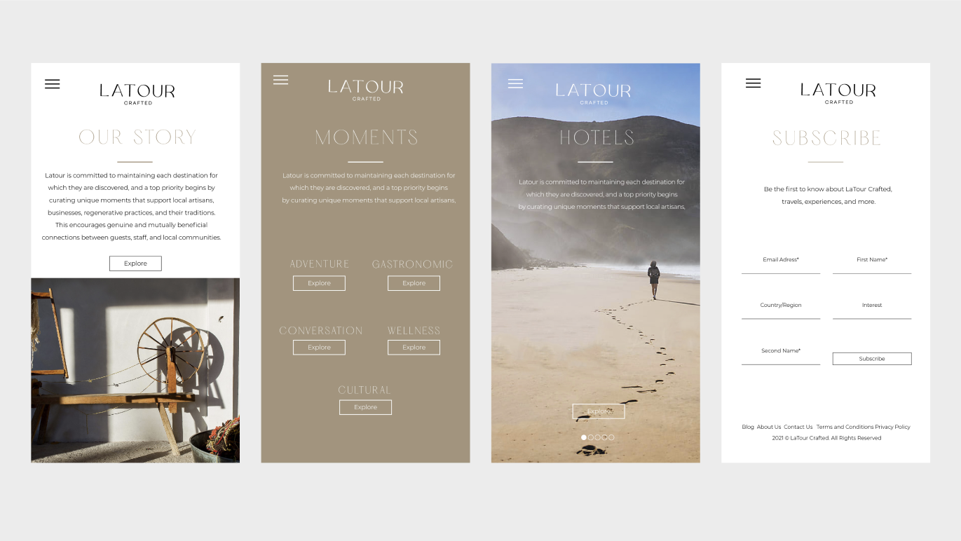
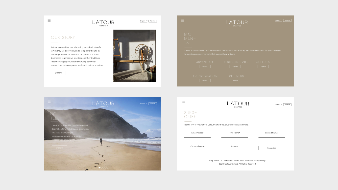
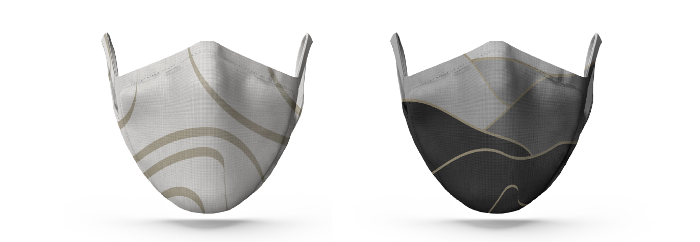
Our objective was to develop a sophisticated brand system that elevated the company's overall aesthetic and seamlessly positioned it in the luxury travel market. The logo takes center stage in the primary branding, strategically positioned at the heart of the visual identity. To enhance the brand's allure, we incorporated elements that introduce an element of surprise and intriguing textures reminiscent of the unpredictable beauty in local destinations.
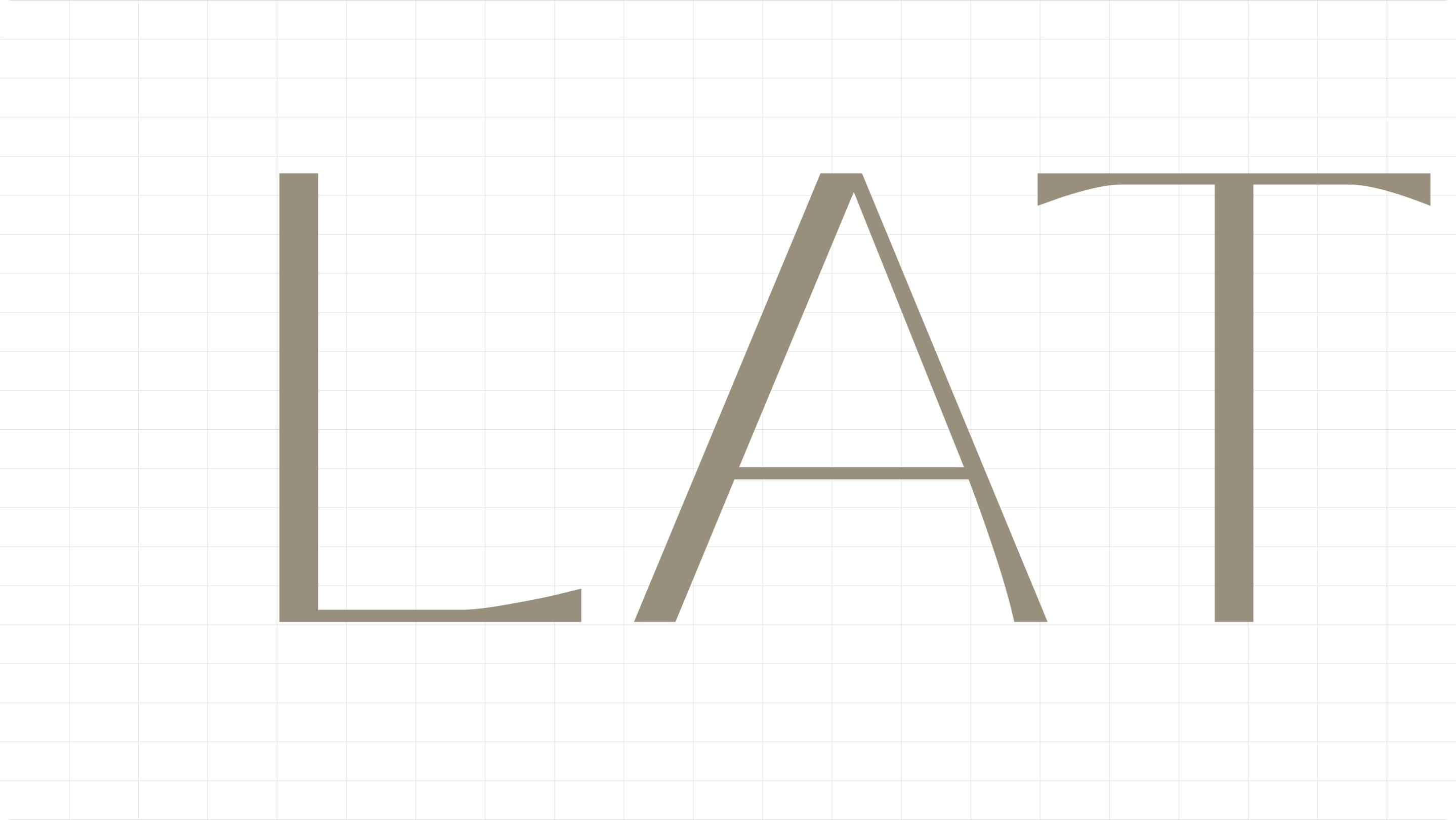
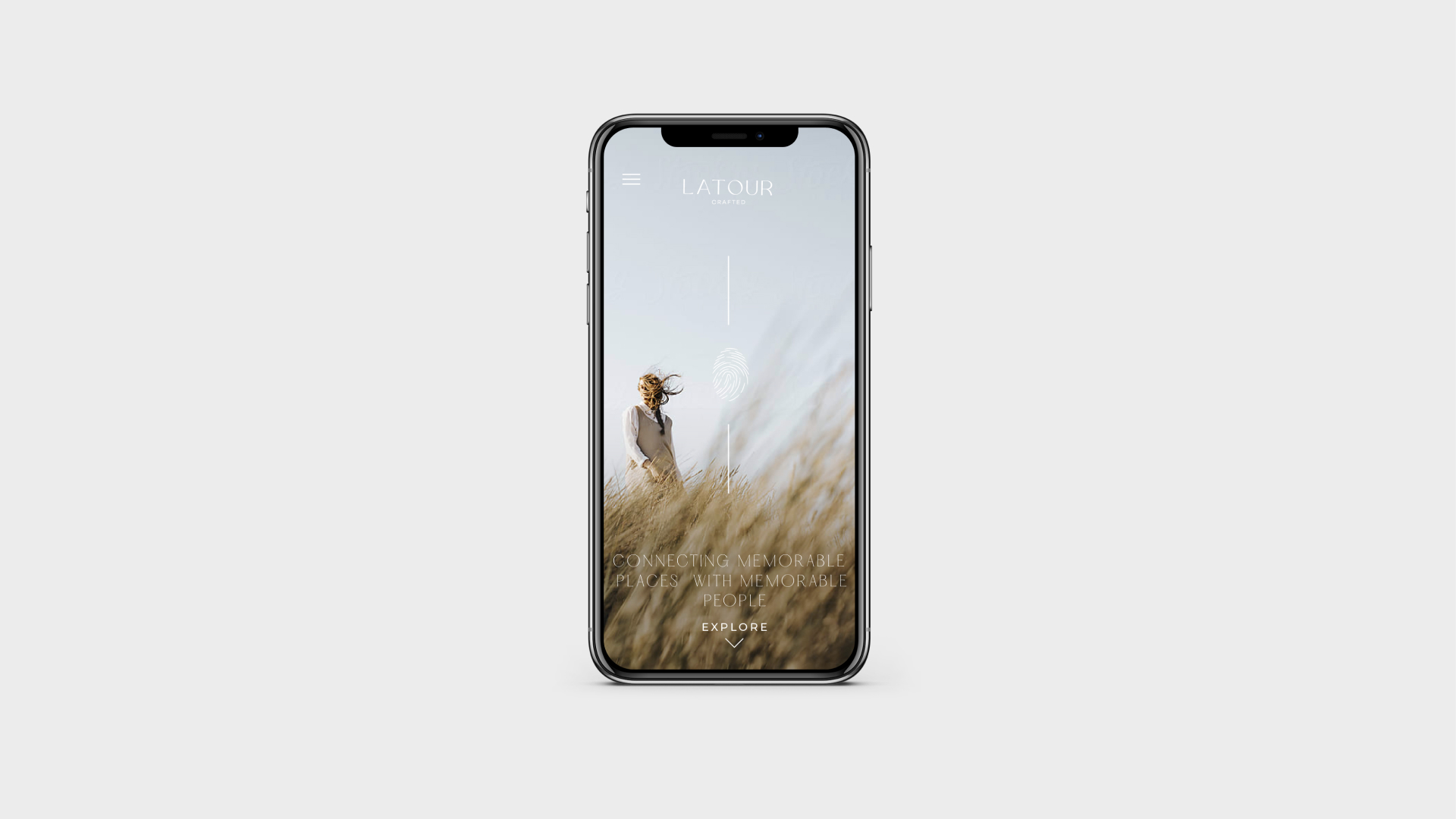
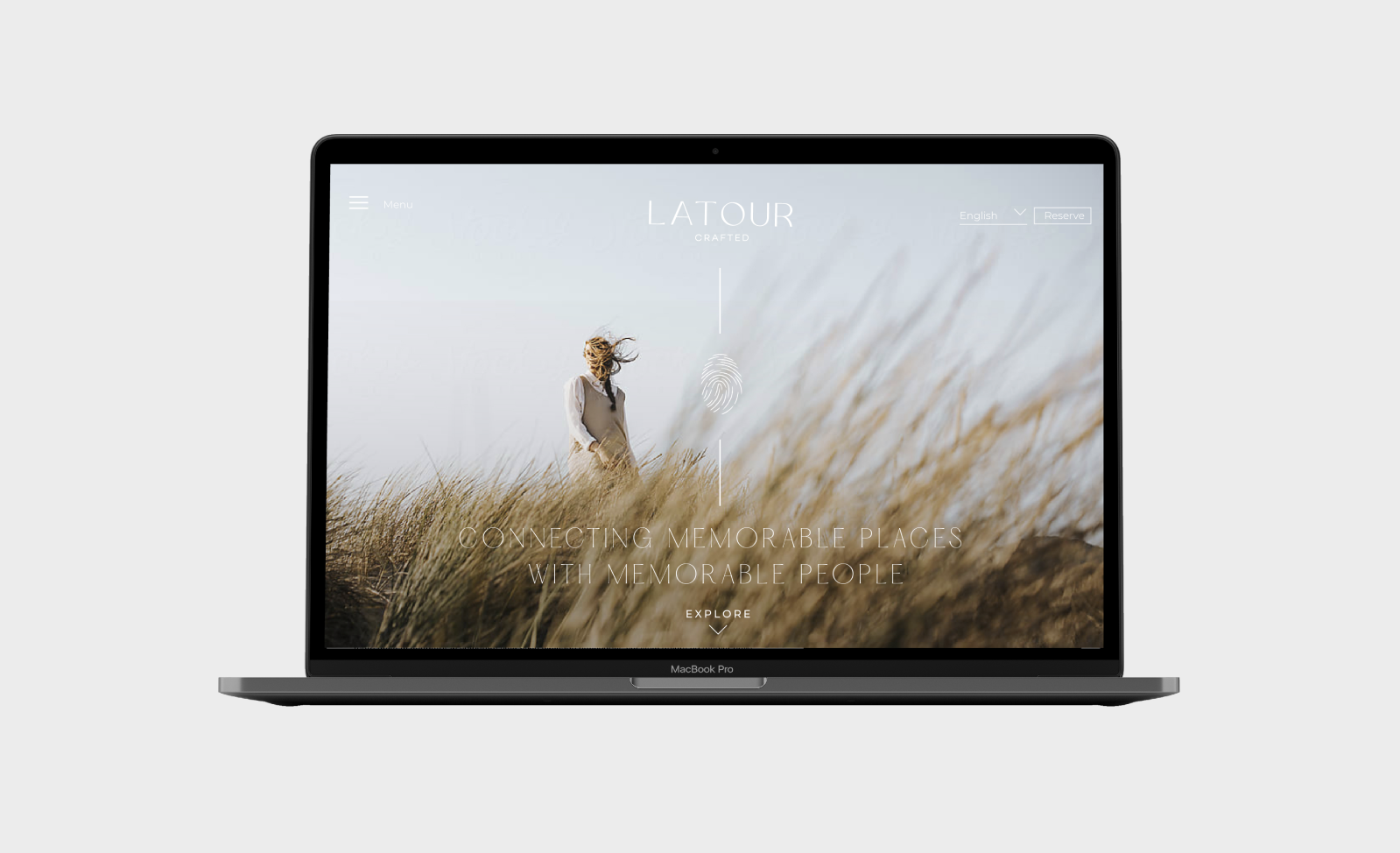
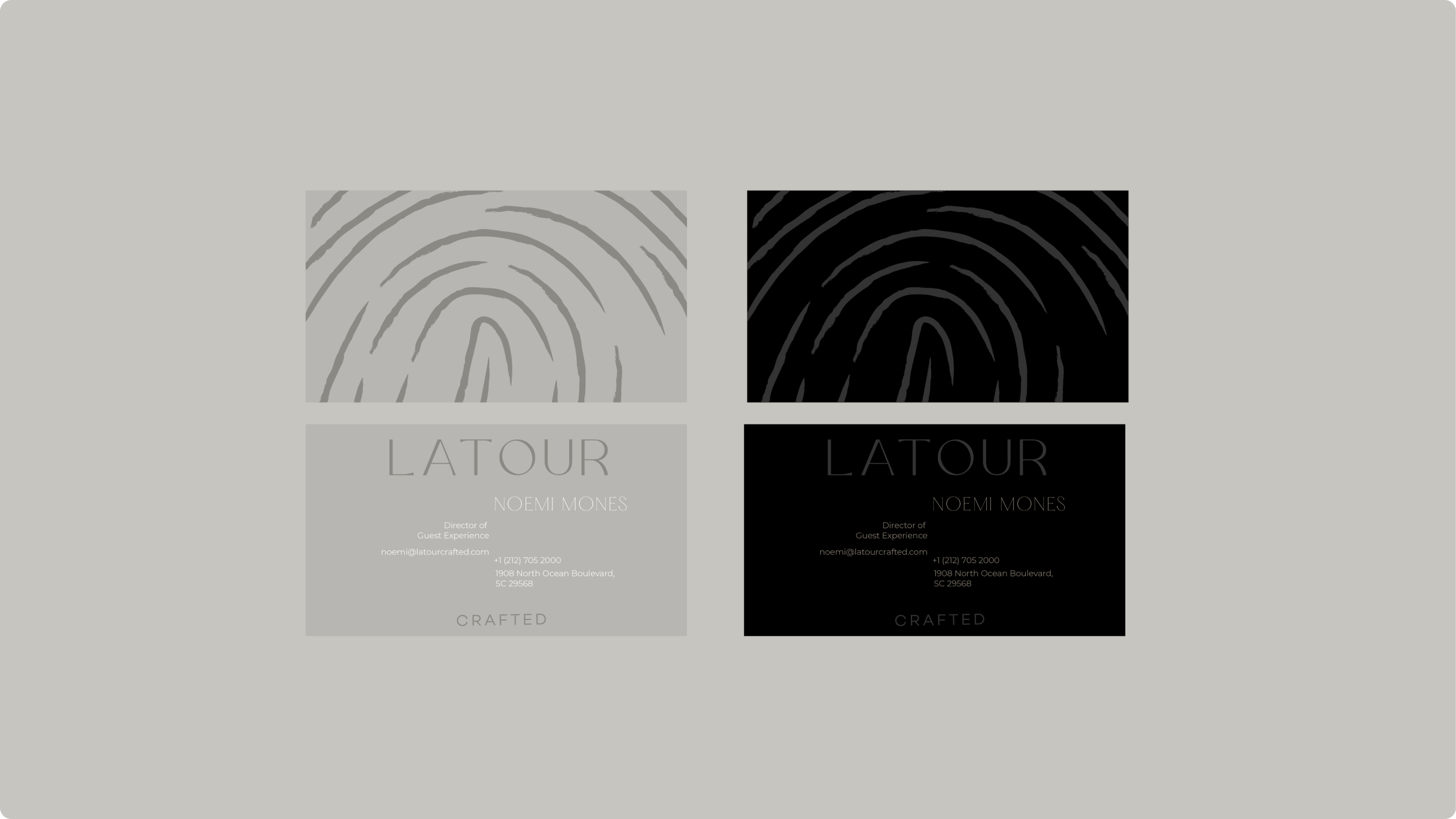
To guide users through the brand experience, we introduced the thumbprint symbol—an element symbolizing the unique imprint of each journey. This addition celebrates the authenticity of local experiences and serves a functional purpose, showcasing our dedication and directing users through the content. With sleek, thoughtfully chosen typography and color palettes, it elevates the overall aesthetic.
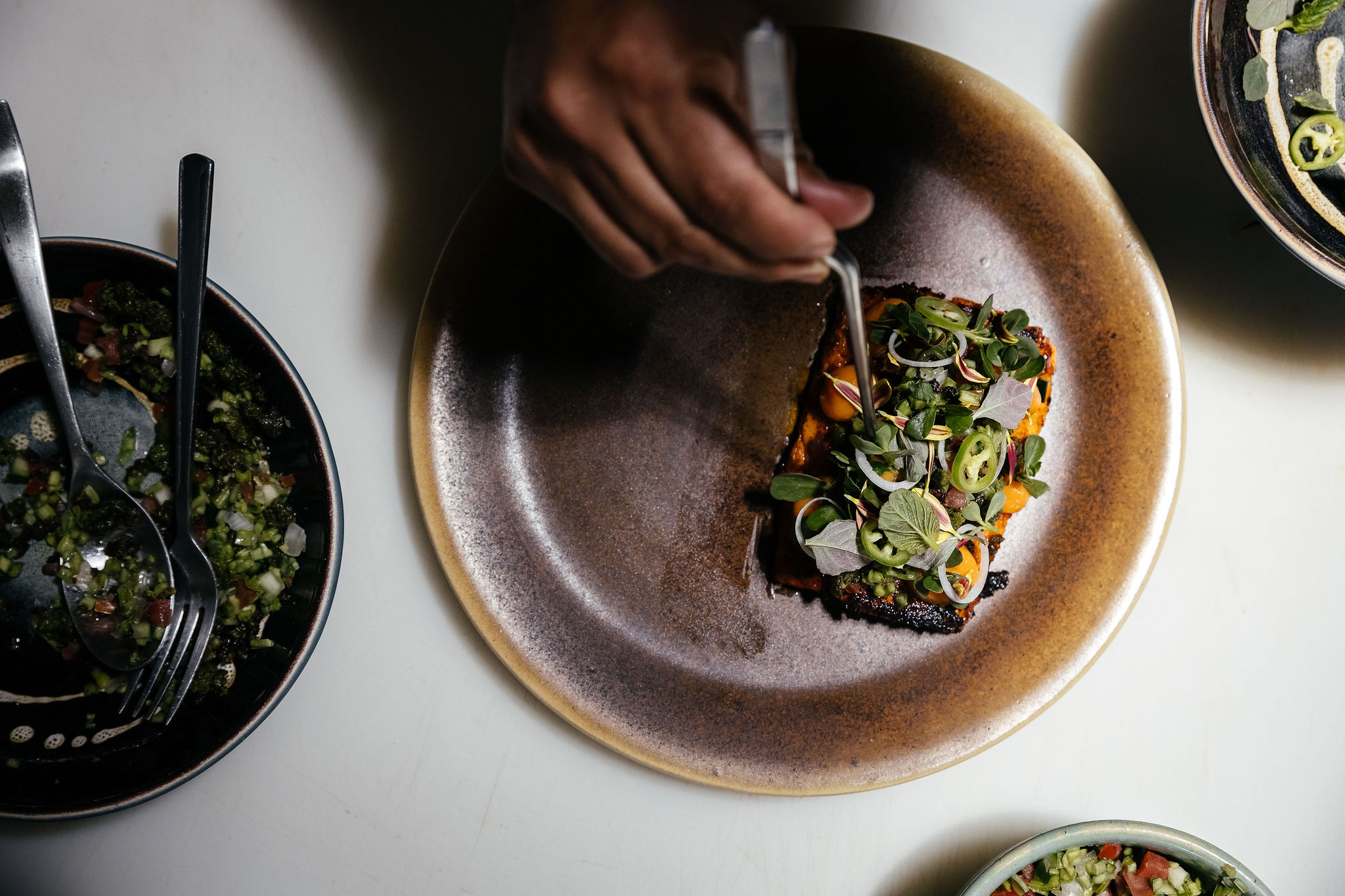
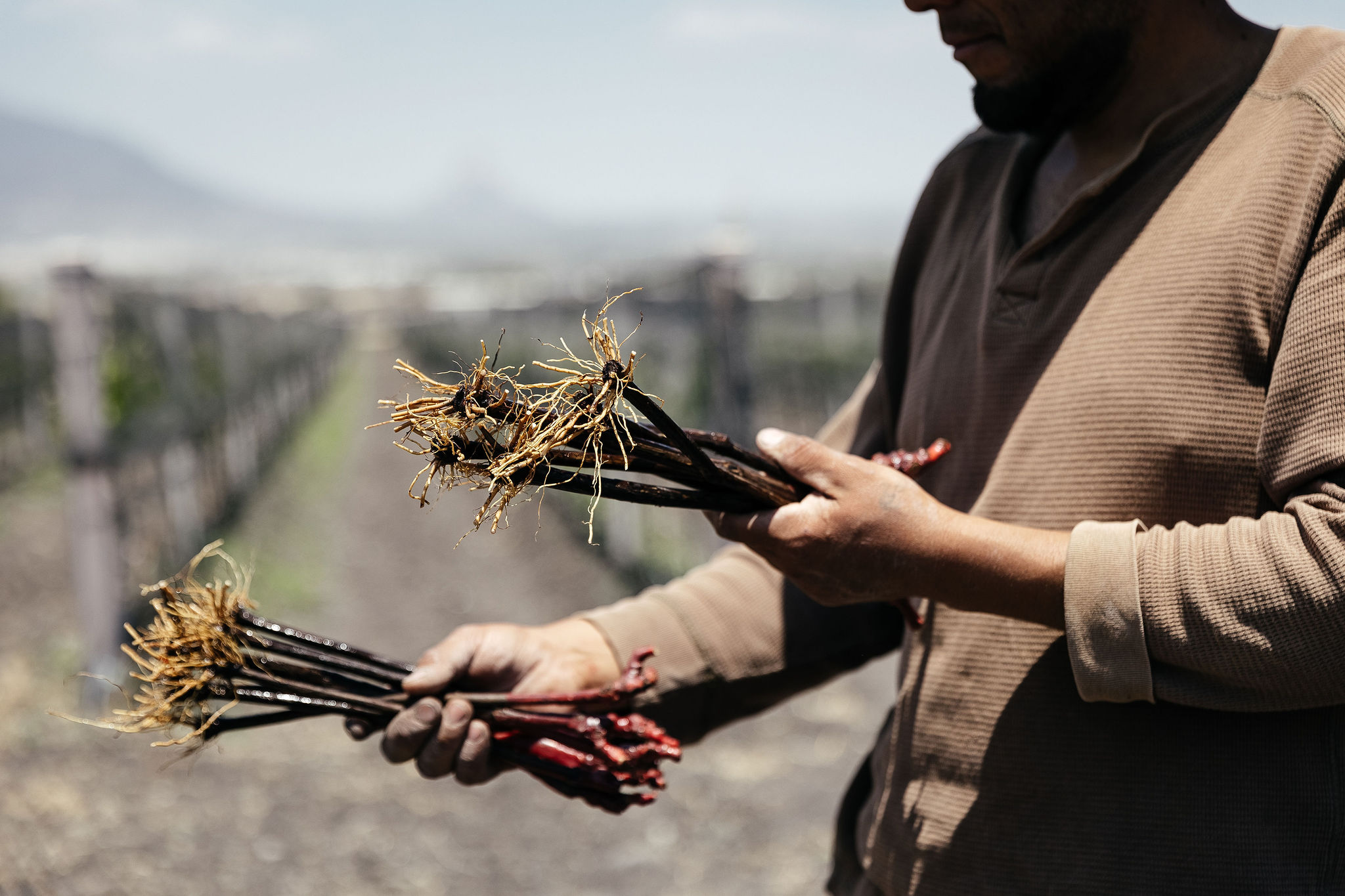
As a core brand principle, LaTour is committed to reducing its impact by designing intentionally and instilling an innately sustainable process. The brand mirrors the ethos of conscious travel by purposefully selecting local partnerships and eco-friendly practices, seamlessly integrating its identity into these choices.
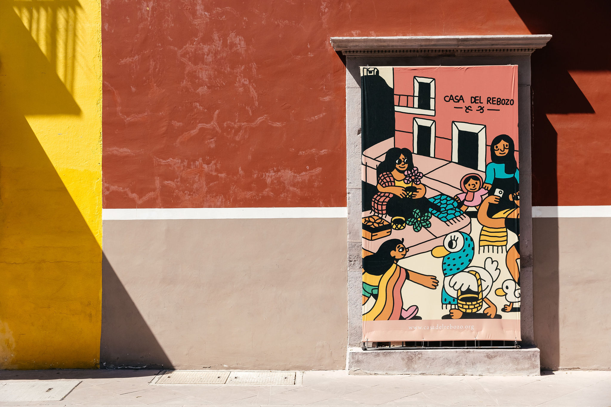
This commitment to conscious travel is evident in the composition of all brand elements, chosen carefully together with LaTour's team. The visual identity crafted from a palette inspired by natural elements, specifically using warm, earthy tones that evoke a sense of authenticity and luxury.
As a result, the branded details, including the thumbprint symbol and carefully chosen typography, create a cohesive visual system that enhances brand appeal and invites travelers on a transformative journey of self-discovery and meaningful exploration from the inside out.
Crafting cohesive services tailored to you.
Turning dreams into invoices one day at a time. Drop us a line – let's make business fun!